
A Library for Olney
Ain’t no big place. Olney is a whistle stop town that likes it that way. Montgomery County’s suburbs meeting farm country. If you google Olney photographs, what you’ll find is an array of upper middle class houses and a few old barns for color.
“In 1763, Richard Brooke received a patent for a tract of land located in the Province of Maryland. Originally known as Mechanicsville, the village which became Olney was established in 1800. The area was mostly farmland, but it soon began attracting artisans. Early residents Sarah Brooke and Dr. Charles Farquhar were devotees of the English poet William Cowper, and named their home after the poet's hometown of Olney in England. The area was later named for their home, which still stands and is known as the Olney House. In the town's center was a blacksmith, William Kelley's wheelwright shop, Canby's pottery factory, and a Benedict Duley's store.
“Both Union and Confederate forces made stops in Olney during the war. Union Generals George B. McClellan and Ambrose Burnside led soldiers through in the midst of the Maryland Campaign in 1862. During the Gettysburg Campaign in 1863, Confederate General J. E. B. Stuart marched between 10,000 to 20,000 troops north through the village and raided it of supplies, including horses and crops from surrounding farms in which they bivouacked.”
from Wikipedia article on Olney, Maryland
Well there you go. Is there another village in America named for William Cowper? Should I dig around and find some of his poems? Though the Wikipedia mention of the flamboyant Southern cavalry officer ‘marching’ troops needs an edit. Stuart was hardly marching anyone. He was off demonstrating his horse riding skills and that of his cavalry, Meanwhile, Lee had no reconnaissance ‘eyes’ to tell him who he was about to run into at Gettysburg, a glaring military gaffe if there ever was one.
Horse and buggy isn’t a primary means of transportation in modern Maryland–save for the Amish who live further east near Leonardtown. The Olney blacksmith is as gone as the wheelwright shop.
In the present day, Olney is but one example of the damage the age of the automobile. But the Olney Town Center Advisory Committee was (still is) dreaming to make the Georgia Avenue / Olney-Laytonsville Road crossroads the center of a reimagined urban village, replacing the strip shopping centers, fast food shops and gas stations. They may yet succeed.
In 2008, the Olney Town Center Advisory Committee was holding public meetings as we begin work on renovating the library. There was the suggestion to relocate the library as an anchor tenant in a new mixed-use town center. Having myself witnessed the impact public libraries have in such settings, I didn’t disagree that it might have been a good plan, except the library needed near term attention, and the renewal plan for greater Olney was still just a dream. Still is, far as I know.
Nevertheless, we took the community desire to reclaim pedestrian spaces as a starting point for our work on the library.
The 16,000 SF library was to grow to 23,000 SF. The library was closed December 30, 2010 and officially reopened March 15, 2014 after years of construction. Actual construction took close to two years, beginning well after the closing and finishing a week or so before the library furniture, books etc. were put in place.
The previous Olney Library was from the 1980s, designed by VVKR, at the time a large architectural firm based in Alexandria, Virginia. It was a modest neighborhood library that was not easily adaptable. The chief building characteristics were somber red brick, low sloping roofs and a mostly inward orientation. It seems curious now, but back in the 70s and into the 80s, a general belief was that libraries needed limited windows–to allow people to read undistracted by the outdoors perhaps–to protect the books–to punish the patrons? I’ve never quite grasped the logic.
Surely, VVKR had done better work than Olney Library. Sited well back from the road and behind a cluster of pines, with a hotel-style drop-off and windowless meeting room wing which was largely what was visible from the street, like a community secret. Parking was located behind the library.

Pre-existing Olney Library from the street–drop off in the foreground and meeting rooms beyond.

Pre-existing Olney Library from the entrance drive photo by the Lukmire Partnership
Hint: the dark hole to the left of the meeting room mass was the library’s entrance.
The preexisting library’s interior was dismally dark, due to the dark wood deck and beam ceilings that received little light, but also because of the limited windows, and a curiously inverted dropped ceiling that ran down the middle like a zipper. If you craned your head, you might glimpse the clerestory windows, that, being blocked by the higher roof rising opposite, let very little natural light into the reading areas. What was so awful about clerestories (other than they didn’t light the rooms) that one would hide them from the building’s exterior? “One does want a hint of color” as Nathan Lane pleads in Bird Cage.

Olney Library - preexisting sectional diagram from the VVKR construction documents, © ca. 1980

Olney Library’s pre-existing adult reading area photo by the Lukmire Partnership 2008
The inverted ceiling in the photo is to the right in the photo. If you squint, the exposed wood ceiling in the adult area reached a tall wall. Hidden in shadow at the top were the clerestory windows, whose only function apparently was to let the late western sun blind the reference librarian at her desk. Granted, the library had been in use for twenty-five years, and librarians have a compulsion to hoard against limited budgets, but this place was u-g-g-g-g-ly!
The interior lighting fixtures were pendant hung from the deck in what was a popular 80s style, so-called eggcrate fluorescent fixtures. In theory, eggcrate fixtures reduced glare from the relentless fluorescent light source. What they were better at doing was creating massive dark areas. In this instance, with no light cast on the wood ceilings overhead, being in the library felt similar to scenes from a gothic novel. I could picture Marty Feldman in Young Frankenstein with his hump–what hump? Wel-l-l-come!
Though surveying the then-existing library, I had to smile. Largely at my insistence, the firm had deployed exposed wood deck and trusses at the Germantown Library–and previously at the main library in Frederick, Maryland–to popular success. It seemed Hamid Omidvar, the County’s DGS chief in charge of construction, had selected us to do it again at Olney, and I was glad to oblige.

Pre-existing Olney Library entry and circulation desk photo by the Lukmire Partnership 2008

Pre-existing Olney Library view toward children’s area photo by the Lukmire Partnership 2008
The architects had backed up the library against the adjacent shopping center–one of those slated for eventual replacement by mixed use development. Unfortunately, in the interim, the view from that side of the library was no better than the blank concrete masonry back wall of the shopping center. Cheek to jowl. One would find no views in that direction. We had the site’s narrow street frontage, the long entry drive and the rear parking lot to work with for views. More than we’d had at Shirlington Library, but still constraining.
In the 80s, public schools and libraries were looked on as subsets of modern office buildings with flat white acoustic ceilings and fluorescent lighting de rigueur; windows were extra. So even the use of wood giving the space character was going against tradition. I gave the previous designers a silent nod; they’d gotten partway there. Though they could have used a good lighting designer.
Library Program
The project brief, it’s program, called for several discrete additions of 4,500 SF to be added to the existing 16,000 SF library, mostly in front, killing the pine trees, along with replacing the HVAC and lighting systems which, far as I saw, would be to slap lipstick on the pig. The building had no soul, was poorly organized with an oversized formica circulation desk and too few study rooms, computer stations, and the rest of what constituted a modern library.
In fairness, public access computers hardly existed in early 80s libraries; everyone was talking about them, but they hadn’t hit the library world like they would later. Libraries still had physical card catalogs, beautiful oak furniture, but unwieldy and occupying the space of whole rooms. Ditto the reference collections with their ranks of thick tomes.
Hidden in the library program was the new Montgomery County mandate for the public buildings to achieve LEED Silver.[1] To my wonderment, the project budget was ample (a rarity in public work). With those thoughts in mind, I began to play what-if scenarios, known otherwise as dreaming in3D.
[1] LEED – Leadership in Energy and Environmental Design
AutoCAD as Corporate Punishment
As an aside, while the firm had been using AutoCAD since the mid-80s for drawing plans, elevations, sections, details, etc., we were only beginning to use Autodesk’s early 3D software called Architectural Desktop, or ADT. I was destined to slowly, exquisitely be driven crazy by this software.
I had begun in 1985 with AutoCAD 2.5, learning the commands by rote, reading the manual. I had more patience in those days for sloppily engineered software and bad technical writing. You drew a vector line in real world scale, and then copied the line, mirrored it, spun it on an axis, created arrays. It did amazing things, all in 2D. What was the world coming to?
Running AutoCAD 2.5 on a 286 clone with 100 Mb RAM, everything worked until it crashed. Control-S became a mantra. Always coming up against obstacles created either by limitations in the software or the hardware, and one never knew which. Strictly my opinion, but AutoCAD became the industry leader not on account of its unstable software but only because MicroStation cost ten times more and required Sun SPARC workstations running Unix. If Steve Jobs had opened up his operating system to developers, the design world would be now only speaking in Apple.
Early Concepts
The VVKR architects (using a gargantuan main frame system) had curiously designed their library with load-bearing wall construction. Meaning, instead of a steel frame wrapped in masonry which was the normal approach to public work, this one’s masonry walls were structural, brick+block+brick. A common enough practice in residential, stick-built houses, but a public library—who’d do that?
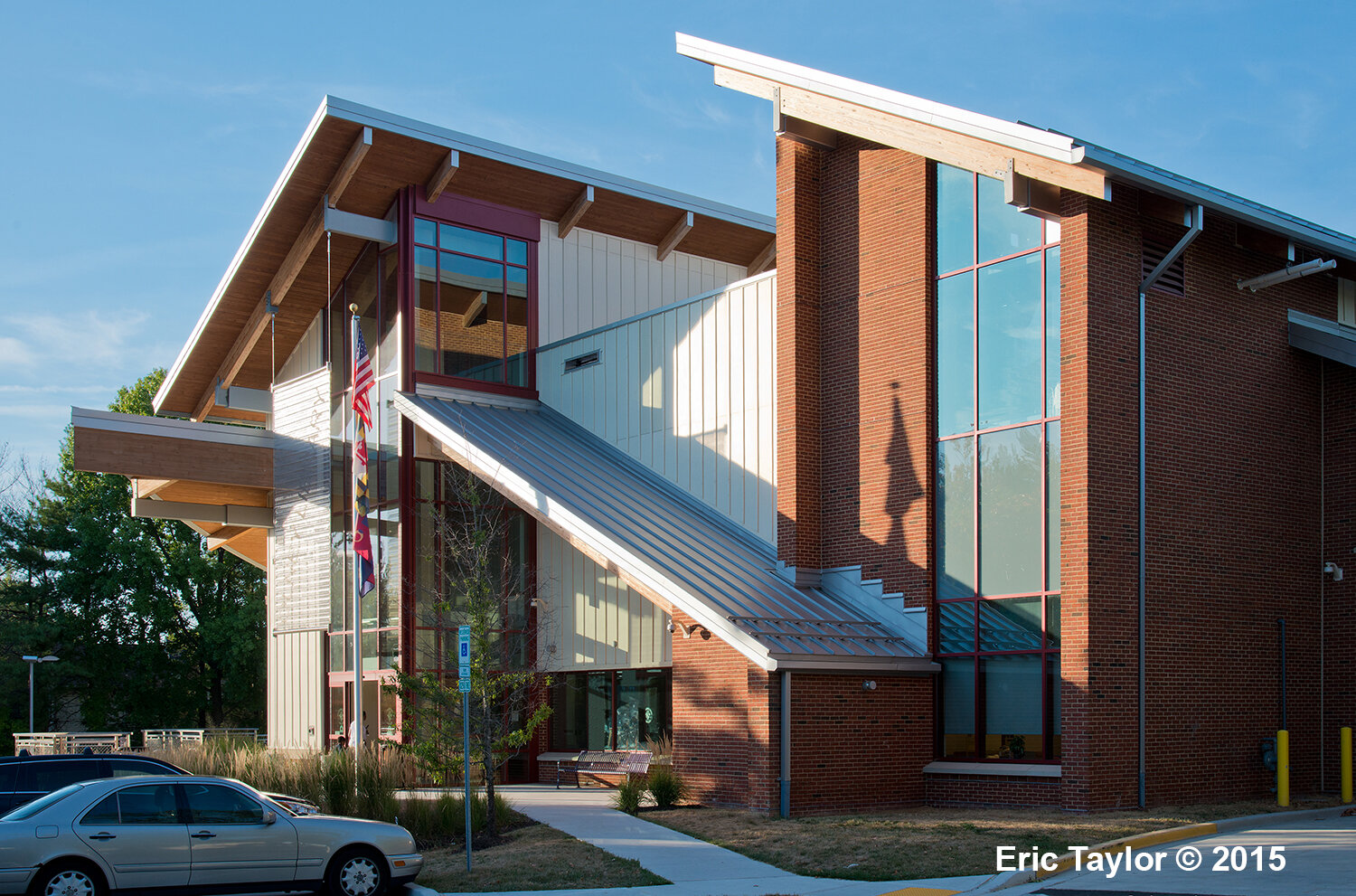
Even the meeting room’s interior walls were used to carry the roof loads; little bar joists on the roof spanned bathrooms wall to wall. Making matters worse, the meeting room took up the only land set off from the principal building mass, forcing any additions to be scabbed onto it. In those days, it was verboten to have windows of any size in a meeting room or the slide projector would be overpowered by sunlight. At Olney, the meeting room sat grimly front and center–and very blankly–as the building’s most prominent feature from the street. No come hither expression in sight. The County hired a Canadian artist to plant artwork on the somber brick to liven it up.
What I didn’t appreciate at the time, though came to rue, was that the rest of the building had load-bearing walls as well–and I didn’t exactly endear myself to Matt McArdle, the structural engineer. He was too polite to say, though most likely thought, we were crazy. By the time we started work on the Silver Spring Library, Randy Haist, Matt’s partner at Columbia Engineering, was convinced I was. Couldn’t have done either library without their excellent steel details.
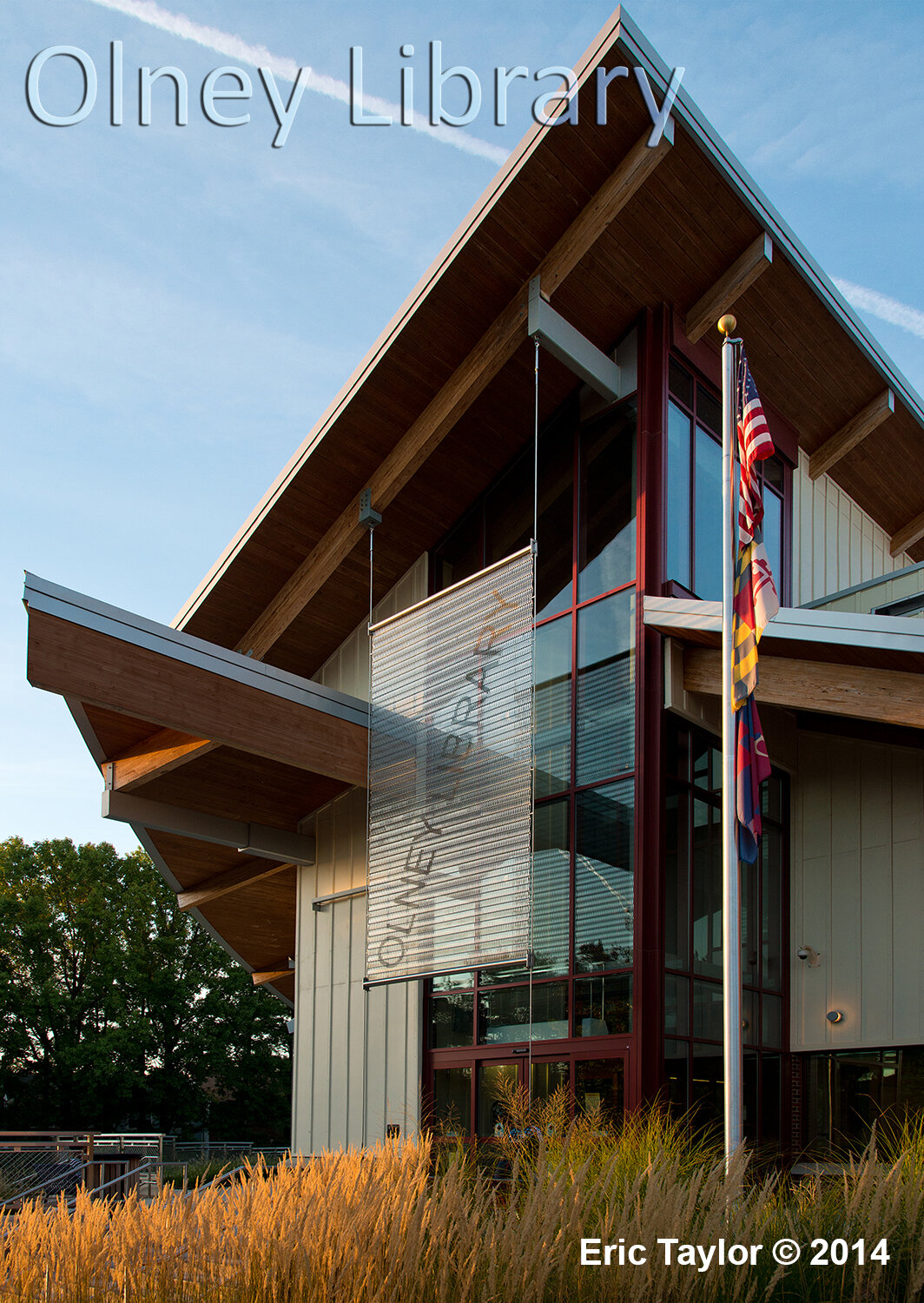
From the first time I saw the library, the meeting room had to go. And if, along with the meeting room wing, the drop off and oversized lobby were demo’d, we’d be free to design a more unified addition, and as importantly, put a new public face on that oinker. Done.
By this time, Hamid Omidvar had been moved upstairs in the County hierarchy, leaving us without a design champion–though I remembered what he’d been arguing for and persevered. Late in Schematic Design, we gained a cohort in crime, Susanne Churchill, a recently hired architect to serve as the County’s project manager. On our next project together, the Silver Spring Library, Susanne and I became a solid team.
Next issue: how could the library be brought closer to engage the street without nuking the best natural feature the site had going for it, the small bosque of pines? Libraries rely on community support, and the first rule of marketing is to make them visible. You can’t entice patrons if they can’t find your building, something someone forgot with the original library. When we talked about goals early with the Olney community, we received their vigorous endorsement to create a better presence on the street. To the librarians, this was already their mantra.
One of the earliest schemes we presented to the librarians and DGS staff included a wide, semi-circular glass wall pressing the entrance drive, reaching toward the street while just skirting the trees. The intent was to make the entrance drive into a public street, complete with fine streetscape details. Nice gesture. With parking (and entrance) located in the rear, I was looking for a form that carried the eye along the street to the rear. A sweeping curve was an obvious move.
We showed other options as well, but the librarians leapt at the curve (in a manner of speaking, since librarians rarely leap unless there’s coffee cake involved). I suggested we place the new adult area there, being so public, but they quickly said they wanted to place the children’s area in that prime location. Perhaps because the existing children’s area was so woeful a space.
Years before when we’d designed the C. Burr Artz Library in Frederick, those librarians had insisted on the children’s area being nearly invisible to entering patrons. They said they were concerned about pedophiles lingering. I suspected it was more Frederick’s large homeless population that concerned them. It was an object lesson in respecting clients’ understanding of their communities.
Design iteration selected, we had incorporated an entrance into the library directly from the curving façade, entering past a small coffee bar we proposed to include. The idea was to create an entrance, while not facing the street, that was as least in view of it. The children’s area was to face toward the street, and YA toward the parking lot, separated by the new entrance and coffee bar.
With children’s area and YA taking up the addition, the larger adult area, meeting rooms and staff offices would adopt most of the original building, leaving the aesthetic question of what to do with that inverted dropped ceiling running like a zipper down the building’s length. It was hard not to think if we reversed the form, demo’d the dropped area, and went up, the resultant space would be a bit like what we’d done at Germantown Library. Admittedly we’d be demolishing another part of the original building, but it appeared the budget could handle it–and the library’s main reading room would surely benefit.
It became rather obvious how little of the original building we were keeping once the demolition was completed: the two halves with sloped roofs standing free of each other with the missing middle open to the sky.
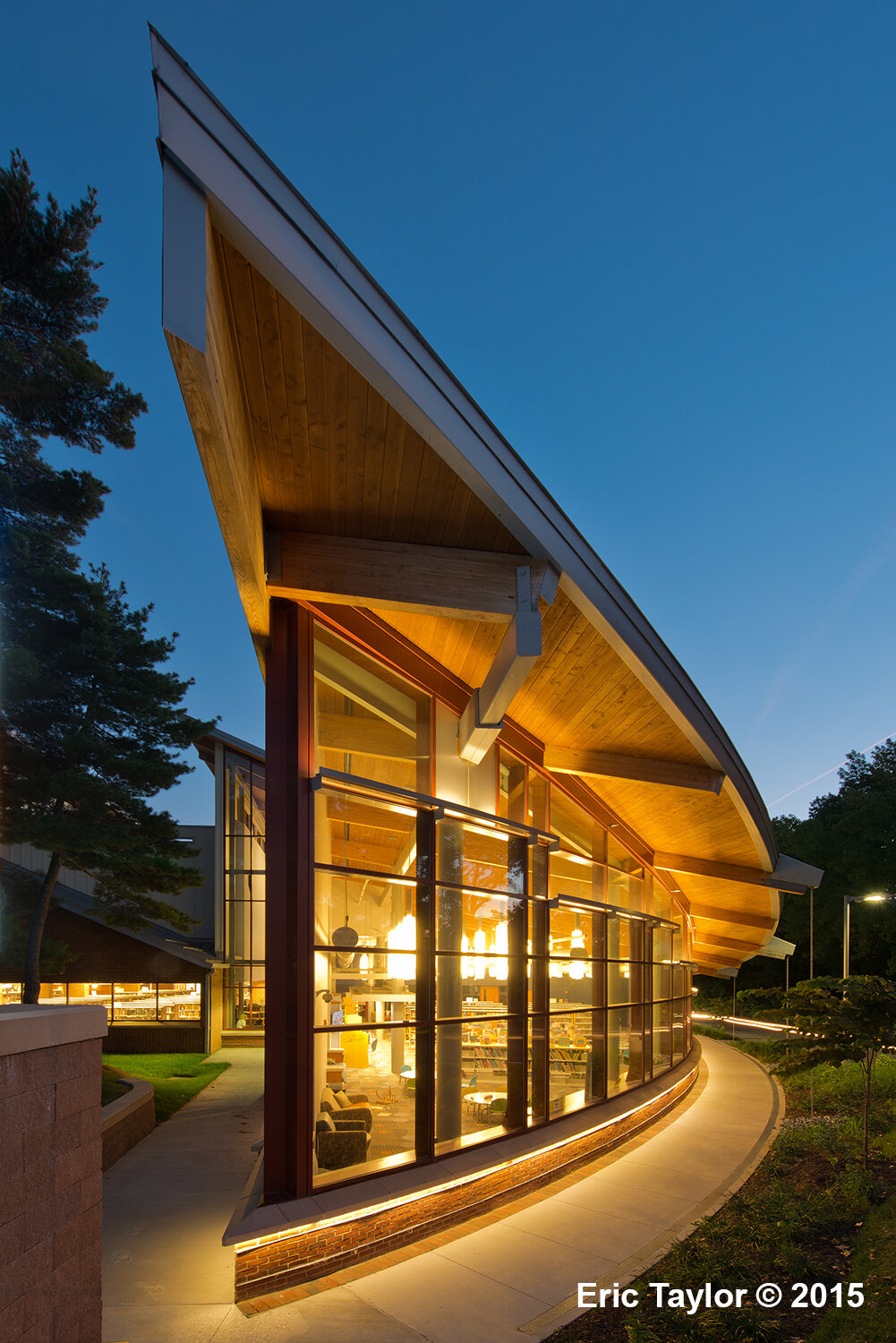
If we were to retain the original exposed wood deck and beams, it implied the exterior would have pitched roofs. So what were we to do with the addition’s roof? The easiest way to handle a curved wall’s geometry is with a flat roof, but slammed up against the original’s pitched roofs would make the building a bifurcated mess.
It seemed necessary that the addition’s roof be sloped as well. The curved glass wall would be enough of a challenge to the original building; something had to knit the two parts together.
Charlie Moore, in some of his work, had sliced his pitched roofs at odd angles conforming with the plans. A sloped roof intersecting a curved wall? Visualizing a curving glass wall slicing a sloping roof like a baker’s cookie cutter—it was simple geometry with a twist. Better, as the end of the curved glass wall drew nearest the street, the wall would rise in a prow. Done and done. Some at the County were skeptical the geometry actually worked.
How to draw it became the challenge.
At the time, AutoCAD’s latest and greatest, ADT software, wasn’t up to handling more than simple boxes. The so-called 3D model kept crashing. By this time we were using 386 machines with as much as 500 Mb of RAM. Massive computing power. Though when the app wasn’t crashing, it simply would forget the last several hours put into it, and revert to an earlier version, like a lazy student who expected the professor won’t catch on. No doubt watching me scream and curse at the computer screen, not many in the firm wanted to mess with ADT.
Though in the end I pulled enough out of the program to cobble together the working drawings. I did threaten Sandra Watts, the project architect who joined the project late, with bodily harm if she were ever to mess with the model. To Sandra’s credit, while she never fooled with the model, she persisted through two difficult years of construction with a contractor who couldn’t always build straight.
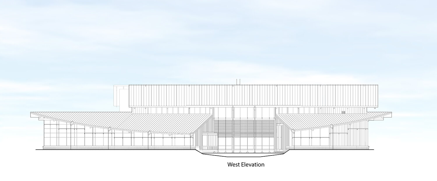
Olney Library’s west elevation computer image by Lukmire Partnership Inc. © 2008

Olney Library final site plan image by the Lukmire Partnership, Inc © 2008
Site Plan
By the late 2000s, Maryland’s environmental regs had become rigorous about restoring the Chesapeake Bay, such that stormwater needed to be controlled for quality as well as quantity–requiring even previously developed sites to be taken back to their pre-development days for runoff. We were reducing the total amount of impervious land area, and we still had to meet the more strenuous restrictions.
Though the library would grow from 16,000 SF to 23,000 SF, we succeeded in persuading County officials not to increase the parking lot as part of the LEED strategy for site development. Public officials have been very well conditioned to view parking as critical, in that patron complaints are directly proportioned to the number of available parking spaces–by the front door.
The civil engineers told us there was no getting around the large, multi-chamber sand filtration structure needed to offset the parking lot’s impervious area, so it was buried beneath the paving. But I insisted the garden space created by the ‘bite’ in the curved addition be made into a second sand filtration area to receive all the building’s roof runoff. The plumbing engineer dutifully collected the rain leaders and piped the runoff to the rain basin to filter the water. And the landscape architect chose water-loving ornamental grasses with a single Japanese maple to anchor the space.
Because roof gutters were impossible on a roof edge pitching in two directions, we employed rain chains (like in Hawaii) made of welded steel chain to direct the water into the same drainage system. I’m told when the rain chains become ice-laden in the winter months they’re conversation pieces. The rain chains appear to be hung, but are in fact ground supported to keep the load off the roof. The bridge with railing answered County concerns about kids mucking about in the garden.
The garden was a gift.

Olney Library view from Olney-Laytonsville Road

Olney Library view of rain basin garden and bridge leading to the front door - or leaving with stroller.
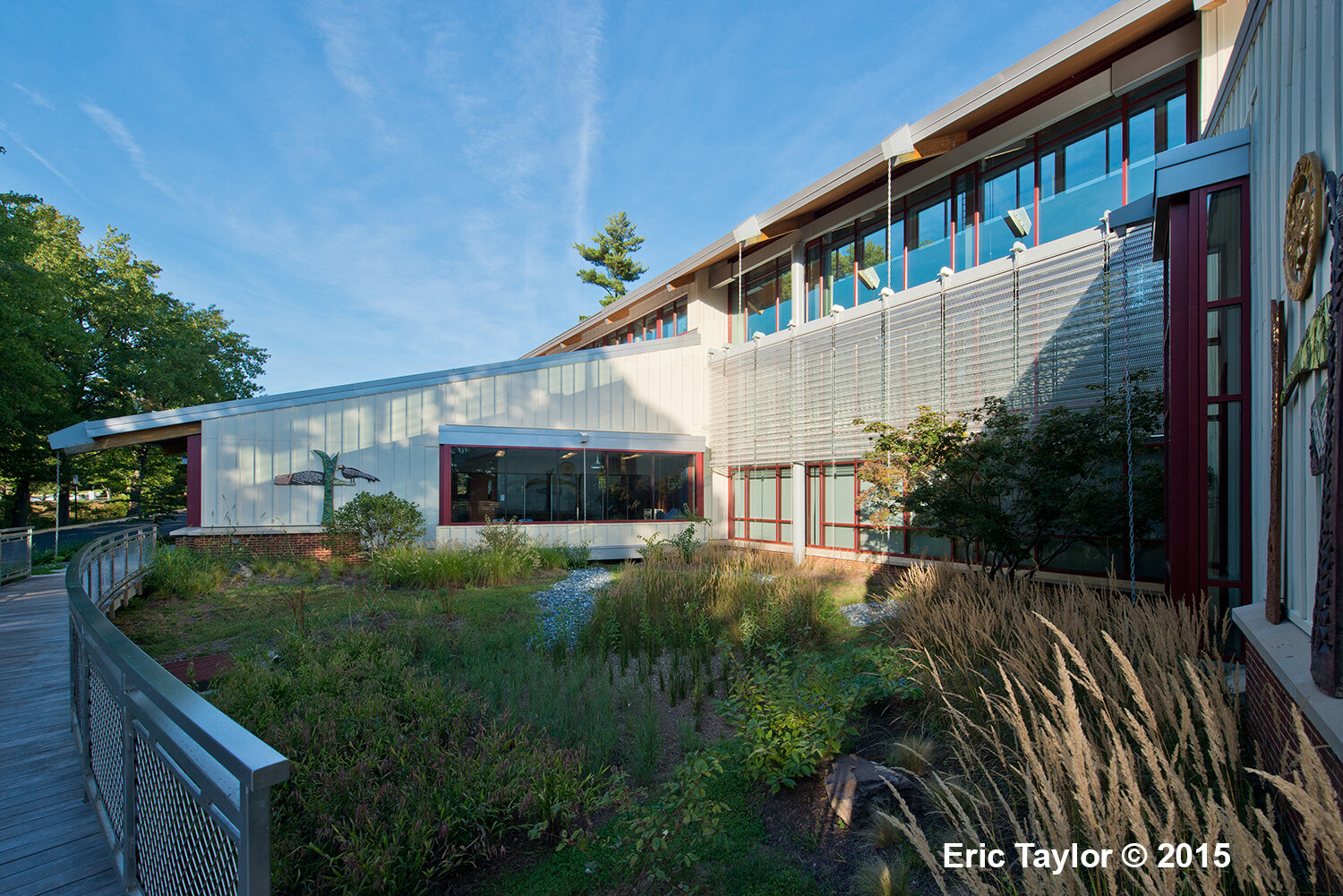
Olney Library view of rain basin garden and bridge looking back at children’s area.
The cute ‘cutout’ artwork on the walls facing the rain garden had been detached at some expense from the earlier meeting room and reinstalled. A serious sculptor’s version of kids’ graffiti flanking Ryan’s garden; I was smiling.
Olney Library was awarded LEED Gold for the multiple ways it addressed energy and the environment.
Following photos of the exterior, the blog picks up again on the inside.

Olney Library entrance from the parking lot
Olney LIbrary view from rear parking lot

Olney LIbrary view from entry drive with drop off in foreground
Interior Design
The library’s interior can be largely described from the exterior. The basic architecture drives both, though the interior has critical functional work to accomplish: to be welcoming, easily navigated, market the library’s materials and be functional for the librarians. Beyond interior lighting, we had to work at getting the HVAC, fire sprinklers, plumbing, and electrical properly distributed without cluttering the open spaces more than necessary.
The children’s area looked to be an easy layout until the librarians declared they needed more book than originally. “Where will the Christmas and Passover books go?” “Where indeed,” I muttered. The branch manager wasn’t happy. Nor was his architect for last minute decision making.
By the time we designed Olney Library, we’d come to believe wider aisles and shorter book stacks sold the books better than any other strategy. We kept repeating “think of Borders” until Borders Books went out of business. There’s now an outlet store in the Borders at Bailey’s Crossroads I used to visit. But public libraries aren’t built to be torn out like shopping centers and replaced when the next fad hits. Probably one reason I love to design them. Longevity.
I expect the technology will keep changing, and I don’t try to predict what’s happening too fast–faster than the funding for new public libraries to be sure. So we placed the comm pipes–conduits–big ones–everywhere except the restrooms, and those were covered by the wireless hubs, so it hardly mattered. I suspect in the future these empty conduits will make excellent mice runs.
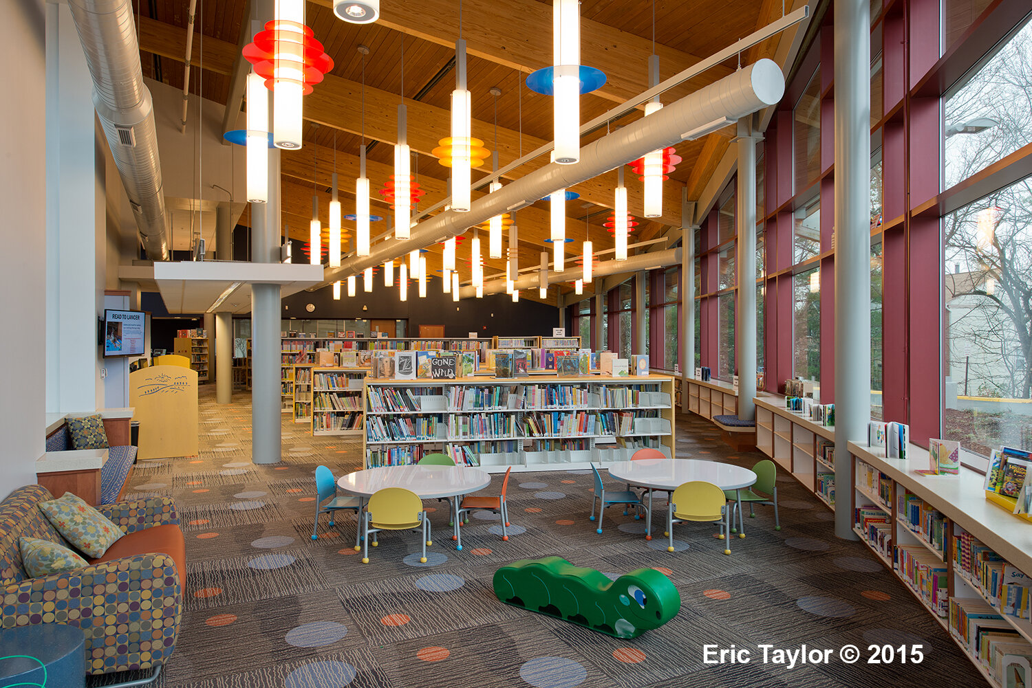
The children’s area is the library’s featured jewel–other than the new gallery. Both are flooded with natural light. Facing west, in the gallery we hung stainless steel sunshades to block the late afternoon sun.
I placed kid-height casework shelving running the length of the children’s area, interspersed with benches for the cookie crumblers. And hydronic heating coils in the slab, since that’s where their bottoms land as frequently. With the tall glass curtainwalls running to the wood deck, the low, running shelving and benches help scale down the space. Frank Feist’s pendant lights make for a perennial party atmosphere.
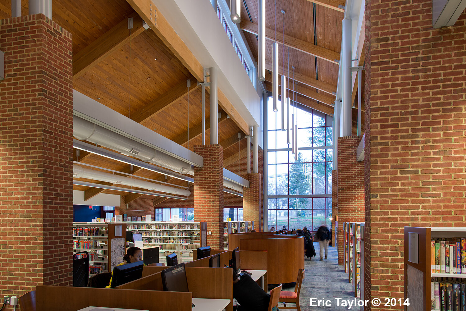
The adult area is more coat and tie, but when Sandra Ragan, our interior design consultant showed us cut sheets of the circular study carrels; they fit. The book stacks are taller in the adult area, but the aisles stayed wide. The public info desks were from a great line of modular office furniture.
Against the wall backed up to the adjacent shopping center, we placed the group study rooms as a way to distract from the lack of view. Did I mention I hate windowless rooms? These had windows, only no view.
One note: public libraries need interior glass into all public rooms to encourage good behavior. I borrowed Shaun Curran’s well-designed wood storefront framing from Germantown to make this a feature running the length of the adult reading area.
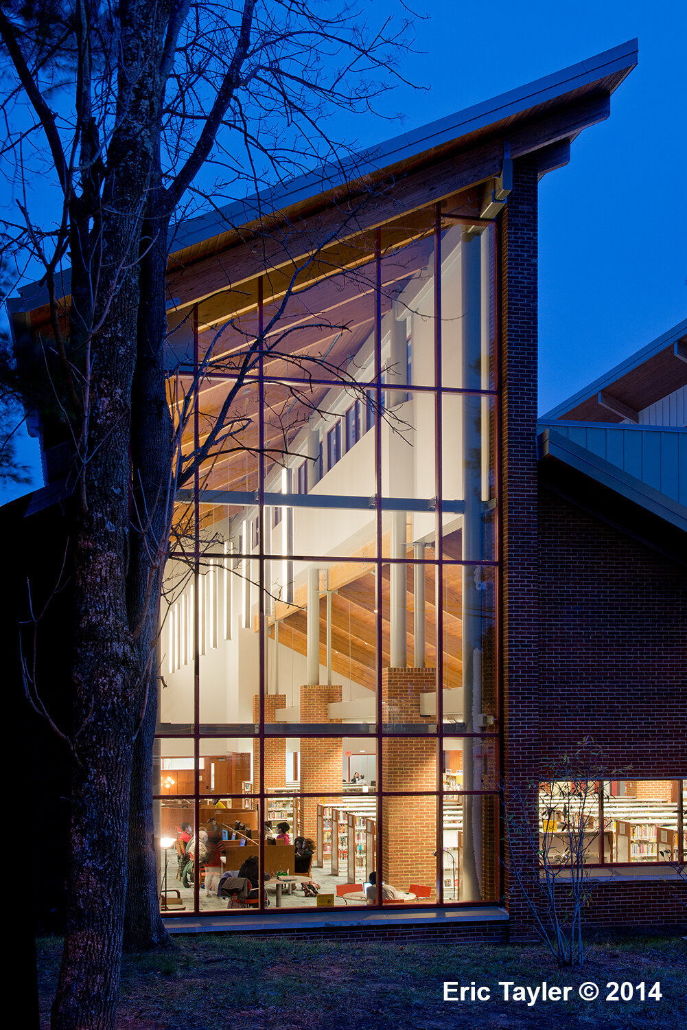
We salvaged brick from the demolished meeting room to wrap the interior columns made necessary by reversing the middle roof bay in the adult area. The preexisting lally columns that had supported the inverted roof were joined by new tube steel columns to carry the taller walls. The brick wrapped the steel for the lower portions.
What the adult area has in spades is a near-cathedral space. Recall that at this place, the inverted ceiling zipper had been replaced. The same space now offers a tall view of the pine bosque. Pines don’t last, but the view goes on.
Wood speaks of a quiet history other materials can’t, likely because we know it comes from a living thing. Stone speaks of the ages that created it, brick the hands that formed it, of all these traditional building materials, instinct draws me first to wood.
Olney Library was a design of contingencies. Lemons and lemonade. And the building’s exterior is driven by the interior spaces we were pursuing. Possibly Lou Kahn’s idea of served and service spaces is carried further than a modernist would take it, but then, I’m from the post-modern era, and I wanted this building to look more like a vernacular farmhouse than an uptown classicist’s icon.
The following photos begin with interior shots, and close with nighttime photos of the exterior.

Olney LIbrary - gallery view past the rain garden toward the children’s area

Olney Library - view of Info desk with children’s area beyond at left and adults at far right

Olney Library entering the children’s area

Olney Library children’s area looking toward the ‘prow’

Olney Library children’s area looking toward the pine bosque
Olney Library children’s area looking back from the ‘prow’
Olney Library view of adult area toward the street

Olney Library view to the right of the adult reading area alongside the group study rooms

Olney Library adult area looking back toward the staff offices

Olney Library adult area study carrels with staff offices beyond

Olney Library - view of gallery in the evening
Library patrons are invited on a cold evening night—when the building best reveals itself.

Olney Library view from entry drive
Olney Library view of ‘prow’

Olney Library close up view of children’s area
Olney Library view of adult area

Olney Library view from the street at night